Wednesday 28 February 2018

Printed Screen Print


Folk Art Influence


This print was created via screen printing using a stencil technique. It means you don’t need to create a screen using photograph screen printing photo sensitive solutions. All you need is re cycled newspaper which hasn’t been printed on. Every newspaper company run very big printing machines and to save production time they take of the rolls before they are completely run out. They are then sold off cheap. I can remember buying myself some my moons ago from the Nottingham Evening Post. What I liked about cutting into the paper is it reminded me of lace or contemporary lazer cut fabrics. The paper cutter paper is on its own a lovely piece of creative indulgence. However I used it to print onto various types of paper. I am very interested in the Japanese papers in an off white or winter white colour. I am also interested in developing backgrounds to print onto to create more interest and uniqueness. 
Concepts for this screen print was to use vintage 50’s style influences with ideas taken through British based meadow plant life.The mood board below has some secondary research and some photographs of wild forna taken locally were I live. I usually create mood boards to help me with my creative direction. The sketch to the right has been created to add a bit of folk influence for the next stage of this design process. As it stands it needs to be made more formal ,using a compass and a ruler to map out design and make it repeat properly. 
I would like to create some repeat patterns.
Sketch book doodles used to design.


Printed Concepts for printed fabrics

Print Concepts on paper are to be recreated onto fabrics for either home-ware or fashion. I have enjoyed creating these initial concepts and I am currently working on adding these ideas to a repeat pattern screen print. I am happy with the archaeology style finish giving the patterns a heritage ,vintage ancient feel. I do think they can be improved in terms of finish , however I don't want to remove the mood and the naive feel which adds a relaxed homely feel. I am responding to a desire to create a contemporary and yet historical reflective design piece. I will need to research what printing ink or effect I will need to do onto fabric. I am thinking Cotton/linen, calico,and silks. 
I believe the vintage patine ancient elaborated de-constructed design warms and nurtures consumers to hold in their lives an understanding through historical visuals in a contemporary style which is akin to ancient antiquity artifacts giving a similar appeal and wow factor. Responding to an understanding that historical imagery transcends through history in the same way nature and the natural world stays with us in a world full of history and antiquity warms the heart and makes people feel part of the the never ending life cycle of natures evolution ,patern-ation and armour.
Responding to this knowledge and an understanding of respect for historical design and contemporary in order to add reasoning to time and journeys that our lives follow and of which our family transcend through.


Evaluation : These initial concept ideas have been created to look at the technique of screen printing and the ideas around negative and positive repeat pattern.Clearly they have been created to evoke a feeling of hand drawn ancient reflections. My choose of scale for these designs could be over sized. They are in fact small single motif images. For these images to work commercially they would need to be created with more refinement, however this could remove the element of free hand sketch appeal. The gilt adds an ancient equity mood, however again as a technique and a colour and gilt idea they work. For these to work I think photographing them and adding them to a more elaborate design my allow these images for life span, otherwise they are purely developments showing key colour ideas for forward designs.

Mark making effects using lino print and  silver gilt.

A variation on initial sketch lino print.

Reseach into Natures Evolution and Patternation.


Natures:Evolution, Pattern and Armour


Its interesting to note how nature influences are ever day lives. The cycle of the day dusk till dawn we live in a world full of amazing nature, encrypting all of this and adding it to a creative practice is something that I have been developing for some time. Previously I have looked into coloration , texture and patter-nation in a way that includes a lot of memory , a lot of vintage inspired antique historical influences within a contemporary practice. The landscape that I live in today is embellished with scenery to be inspired by. A landscape which hasn't changed a great deal for centuries. 

Historical and contemporary  intertwining through time. One of the areas which I use as an artistic direction is to to take historical influences and mix them together with contemporary elements. One of my reasons for doing this is to evoke an value of heritage in order for people to respond to my values.The value of the landscape maintaining its view point of natural integrally is reflected in my eco conscious values of  Arts and crafts. I am wishing to add value to other peoples beliefs of eco consciousness in a way that includes a value of heritage through time. Incorporating an awareness of evoking history of plants,ecology, evolution through a method of juxtaposing style within a hybrid methodology of contemporary and traditional methods.


Pebble Prints


Pebble Print:Beauty in Decay
The encounter between living and the dead is the source of the stories that we tell to make sense of being alive and to be that explorer at that moment is to be given back the power to tell those stories for yourself. We don’t want to be passive consumers of history with a capital H nether spoon-fed (Urban Decay)2011. These words have been taken from a book I have researched Beauty in decay compiled by RomanyWG words by Patrick Potter printed by Urbex. There are a series of these books and they are really beautiful images of Urban Decay, similar to Art instillations.
Close up of gold leaf detail.
While I was printing my lino prints I felt an affinity towards faded printed images maybe the third or 4th print using the same lino with only one application of ink. I felt that the patina, warn away faded out effects were more compelling and relaxing. Similar to beach comber, bleached out effects created by natural weather giving a feeling of antiquity and nostalgic reverences.
Some of the work I achieved in my sketch book I felt was a bit predictable and even naff, so to find myself as far away as possible from this I have experimented with an historic look, adding a back story almost of hidden times gone by, a live cycle of age within a new print. Vintaging adding the power and allure of Urban decay. This somehow proves that society is not indestructible revealing narrative ,a life journey a reflection of life and death.
Aesthetics of Decay by Dylan Triggs explains in more detail the allure of Urban decay, seeing urban decay proves that society is a mutable process. Seeing our society from a perspective of the beyond.
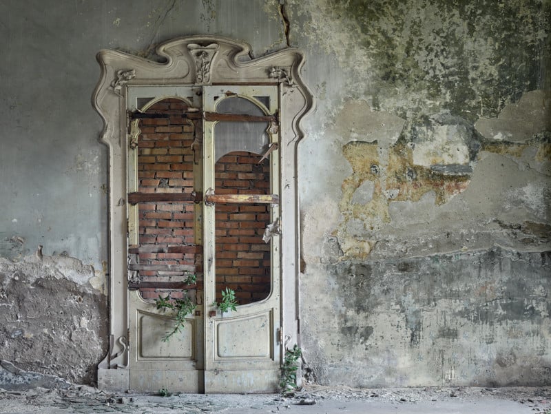
Some photographers have said that old building have souls seeing nature reclaiming old buildings conquering what man has left behind in some way gives me hope that nature beauty can be re found resurrected from urban chaos. In the same way I wanted to remove a feeling of commercial expectation away from my prints and make them more like contemporary urban frescoes of the future.

Rebecca Bothory photograph : Orphans of Time Series


Rebecca Bathory photograph.


"Rebecca  Bathory first fell in love with decaying beauty of abandoned buildings when she photographed an abandoned school in 2012. This allure took her to 30 countries and over 500 locations, accumulating in a photographic series called Orphans of Time"
 (Jayden Simpson: http://petapixal.com2017)

This colour duck egg as a translucent quality.
 
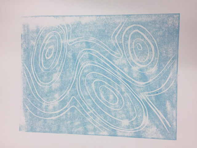
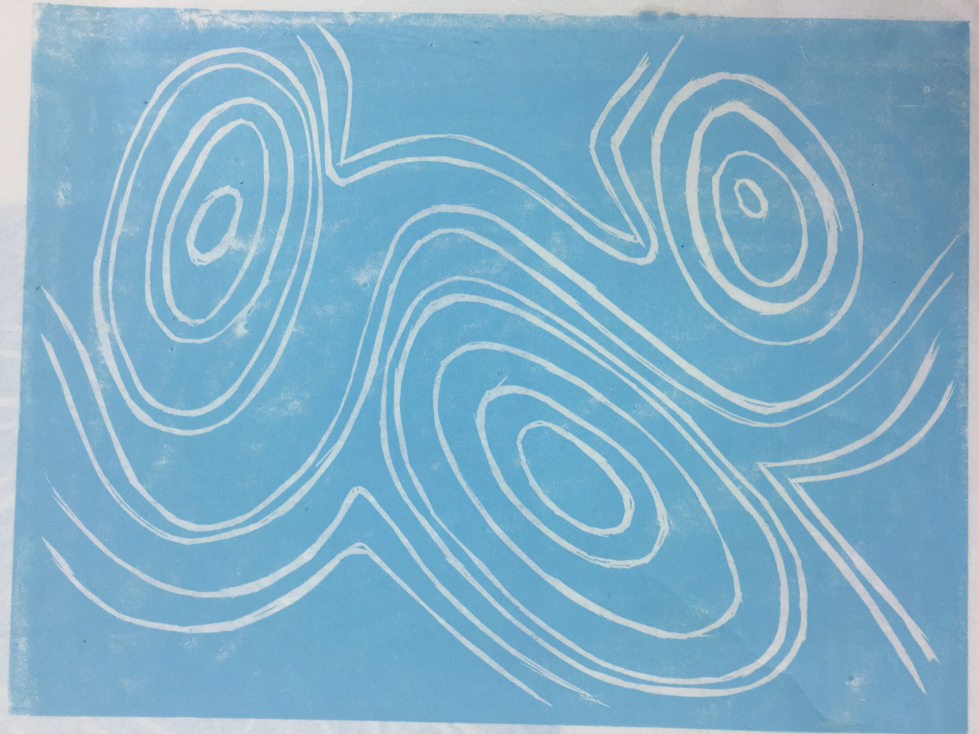
The lino print of the pebble sketch lino cut is an refined version of the original which I think is a bit stayed, a really like the colour of the inks and creating a blue series of prints is a great idea. I may try and add some gilt in a more refined way and see what they look like.Possible use may be on tea towels for a kitchen. A surface design for a dinner mat. I combined it with a lino cut of sea gules which gives it more interest. The indigo colourway I really like its strong and bold. It would go with many colours within a lot of interior spaces.
Refined Pebble lino Print

Indigo colourway of refined pebble print.

Pebble and seagull lino print development.

The lino below is a two colour lino using two different linos to create a more 3D effect which is very much an interior fabric pattern choice. I can see this with other lino prints that are more figurative.This print is more of a secondary print to go with more dynamic imagery to match and contrast. Rather than a feature print that would stand alone its use would to blend with other fabrics.
2 colour lino print , evoking a hand finish artisan sketchy effect.

Hand cut Lino Print with gilt effect added by hand. This effect has added an historical hand made effect.

Lino print with a different effect using bronze gilt to create an ancient artifact feel.

Lino Print one colour ,agate effect patterna-ation with silver gilt.

Faded out print using less ink.


Mounted pebble print on Japanese paper.

Printing Evaluations

Two colour Lino print:two colour adds a bit more depth and 3D effect, mixing similar colours adds a suttle effect. I am really enjoying using different types of blues.
Two colour print using to lino blocks.


Two colour Lino print using stronger contrasts

Single print seagulls lino print

Trying different backgrounds 

Cutting and placing images to create different effects.

Wood Block Print Technique


Wood block printing is a technique I have been sampling over the last month or so. I have choice to use Lino which is something a little more pliable than the traditional method of cutting into wood which history has surpassed since. Lino was introduced in the late 19th century and has been used by many print makers since including the likes of Picasso, and a number of other well known contemporary artists. 

The image on the right below the first print is my second print the first was a pebble repeat which I have added gold leaf to in bronze and silver.

 My evaluation of the technique is that it is a technique that allows you to simplify down your ideas and the finished look is a professional finish without any paintly unwanted effects that you get if you were to paint. The effect that I like is after one or two prints have been printed and the effect is a washed out denim effect. A old vintage warn out distressed look which in effect adds warmth and homely charm. This is the look I was looking for in my work. I will continue to experiment with lino printing.I would like to mix this technique with some screen printing or photographic printing. To try and create a Hybrid of contemporary and traditional practices.
Printing Equipment roller, knife, glass base


Black thick tap is used to keep paper in one place for printing layers.

Agate effect print.

Printing Techniques And Application

                                           Printing techniques :Two colour lino print.

Printing equipment Roller, Spatula,glass surface.


Tracing technique to consider were second print should go.


First layer of Lino Second layer below.


Initial Lino printing technique I have choisen is a sketchy organic style of cutting. I have used an image initially created in pencil taken from an initial project brief created by the RCA in regard to improving sleep . I have designed a number of ideas within a sketch book and decided on looking at organic forms those forms sent me thinking about what I wished to create I therefore to initial images while walking in my local countryside, however what I found was mainly green or brown these colours and the natural items I was looking at wasn’t fitting for the project I was pursuing. I thought about harmony and tranquility and remembering were I always feel calm and relaxed I remembered days on the beach ambeling along the beach. I thought of lazy days, however I kept thinking about nature landscapes and seascape seemed fitting. Sand wasn’t tactile enough and the imagery wasn’t compelling , shells are too bathroom based for an image to calm within a sleepy lounge or bedroom. I used to collect shells and I love drawing them, however I needed something else as I was sat roaming the internet which isn’t necessarily the best choice as it’s too fast a space to contemplate.

I looked past the computer and picked up something that was decorated in paint to mimic a lady bird. I shot out of my seat looking for more of these found objects from nature’s landscape. I had found my ureaka moment. The object with a calming tactile equality that is explained within the the minds of nations around the world. An item used for tranquility, contemplation, relaxation and harmony. The Pebble Collection had been formulated within these concepts. 

While researching I found a number of interesting points and within ancient sociology links to homage to live and death which I could  link in to the my work moving forward and which I have used previously. As I was researching and creating an idea for an object which could warm up a bed, warm hands, and warm feet . It’s purpose was to relax and help sleep, however it needed to be opened and in doing this I became reflective of what might be inside a pebble. This is when I reached another pathway of elaborated decoration created by nature’s evolution using the colours of the rainbow . Agate was added to part of the pebble collection.I will add images moving forward. Fabrics and details of interest to create a collection of interlinking concepts and ideas.

Monday 19 February 2018

News Paper Article by Ann Murphy


  Up Cycle Philosophy

I was reading the newspaper the other day and I found this interesting article on fashion direction that interests me in regard to it's up cycled theme and approach to designer lead fashion styling. The look is being approached by a number of key designer lead brands including Gucci and Coach. The concepts are based on vintage clothing along side thrift shopping. I way of giving not just their consumers a collection to follow, but to add value to fashion people who can still look similar without the need to spend so much money. What came first the chicken or the egg, is it street fashion imergying through designer lead collections or is it a new look at ecology, saving the planet by promoting up cycling by creating this key look. What ever the order it's something I love creating myself and believe this approach of adding vintage to new contemporary design is a  psychological look at sustainability making clothes that have longevity and showing how clothes already made can still be worn within new fashion fields


Newspaper article by Anna Murphy


Winter Photography


Angel Pattern Repeat.
I have used a photograph that I took over Christmas of a garden statue which was covered in early morning frost .The frost looked a bit like a crown and added texture and interest. The image below was created on photo shop ,the photo was turned into a grey scale image and then created in to a screen print. I used the screen print to create different coloured printed images onto different paper colours to develop some commercial colurways for interior wall papers and surface design ideas. The repeat below could be spread out a bit so there are less cherubs to add a more scaled down placement of the cherub image. This would make the image less busy and more appropriate for wall papers.
Other ideas for backgrounds could also be developedThe image below is the cherub reading as a pattern repeat for screen printing. I am also creating a hand drawn image for screen printing.This image could also have photographic a deconstructed ancient warn away gilt finished rust effect with  weathered backgrounds in various colours. The images are one layer created on photo shop. An extension to this would be to add different types of background layers and fabrics could be developed with the angel in the garden initial photograph. Developing different scales including a screen print simplifying the colouration down changing the colours and adding different effects.
       The Cherub in the Garden
Tonal image with background removed .


Shadows on the brickwork and snow evoking reflections with tactile interests for print design.

 Ideas for photographic printed textiles
 I have always had an interest in photography and over the Christmas period I had an opportunity to use some excellent Cannon photographic equipment while studying my Masters in Design. I am currently looking at different techniques to create and refine different images. I have used a micro lens fir the photo of the garden angel. I am looking at printed fabric design for interiors and fashion. This particular image I will be having a look at photo shopping using Adobe CC in order to create a fabric or a wall paper. I can see it developed into a wall paper using a gilt background. I have recently added silver and bronze leaf to a printed Lino design which I really enjoyed. Adding more detail to a one colour Lino print adding an extra dymention to opulence and uniqueness. 
Original Cherub Photograph.

Brief over view of project

Poster for MA Show The Poster used for the end of project show at University Lincoln. MA studio in Design end of Degree Show June 20...