Tuesday 27 March 2018

Photoshop linen fabric developments

Photographic Screen Printing

Photoshop for photographic printing using the CAD suit machinery specifically the me mac printer needs specific printing technology. Firstly the actual size of fabric swatches that you are wanting, needs to be created when you create your photoshop page similar to creating a word doc.
It is a bit difficult if you are not used to using the software , practice will hopefully make it easier for me to develop and remember.
I have created different coloured backgrounds with the cherub photograph used on the screen print being re created as a linen fabric print. The cherub has been enlarged to be used in connection with a smaller cherub repeat in faded pastels, natural linen background and also black. The cherub has been used in grey scale and also faded grey scale with colour added using different effects using the different brush effects. I have created 18 different variations in order for an effect range of colour variations and styles in order to equate a collection favoured in commercial concepts.
I will be sending the different designs which are jiffs which have also been flattened using photoshop tools will be send via Dropbox share user as the images use a lot of space and emailing may be difficult. I will be asking for a colour match onto a swatch of fabric to check colours are what I am wanting before 3 metres are printed. I am also printing mounting card to hang the fabric swatches on for display purposes
Original cherub photograph with the background taken of using photoshop tool.
Linen sample fabrics from Me Maci CAD

Colourway pastel lemon

Rose cherub colourway

Wallpaper samples

Wallpaper roll colour swatches

Colour swatch :Bohemian colour story

Linen cherub wallpaper colourway

Screen Printing Metallic Cherubs


Mettallic Screen Printing

Screen printing metallics is a bit different to other screen printing inks. The difference is that you have to push the ink through the screen using a sqidgy twice and not just once. Remembering to lift the screen of the paper to push the ink back to the beginning again. I wanted to use silver and gold onto my cherub screen to reflect the ancient use of gold when the context is about the after life in essence showing how the image is above the natural world paying homage similar to how gold and silver was first used in churches and  cathedrals. Also used on Egyptian death masks to explain the importance of the after life. I wanted my cherubs to show an opulence and shimmering effect to entice the view to feel moved effecting a reflective harmony.


Gold ink onto tactile natural card cut into swing tickets.

Silver and gold cherubs onto card swing tickets.

The screen showing the liquid based gold Matallic and the masking off of other cherubs to just print one.

This image shows how masking tape is used to show were to place the card so the swing ticket is printed with the cherub in the same place to gain a professional repeat technique.
The ink which is gold is a lot thinner than other inks and therefore it’s a bit more difficult to print. 
I need to practice passing the ink through the screen to get a cohesive print approach , initially I was pressing to hard, sometimes not enough. Practice hopefully will make me more consistent moving forward.

Tuesday 13 March 2018

The Cherub Screen Print

Printed fabrics using Memaki digital photography printing, developed onto photoshopped. Saved in Jiff settings to suit the machine in order to manufacture and print. I made sure I got 3 across the fabric to maximise print capacity.


Practical Screen Printing using Photographic Print


Screen printing using adapted photography is new technology mixed with traditional printing methods. Initially photoshop was needed to take away the background of the photograph away then the actual pixels needed to be at the highest level. This makes the dots of the photograph as small as possible. Then I have made the image the size I wished. A large traditional staggered repeat and a smaller repeat. Below are some initial prints onto paper which would be wall paper on rolls which I will be creating moving forward. The image below shows the screen printing table were my printing has been done. The screen is painted with photographic paint. The image which is printed of is rubbed with vegetable oil to make the paper clear. It is then placed onto a large photo image maker with a vacuum keeping the screen in place while the image is photographed onto the screen. The screens can be used over again, however they do need to be cleaned.

The idea behind these images is to create a series of different colours for different wall paper for interiors.

The scale is a fashionable new style used in boutique style surroundings. I printed onto sugar paper, however for the real wall paper I would would use a eco conscious plain traditional wall paper with a matt finish.
However the black background would suite a high gloss effect to create an opulent feel for a special location. Bedroom or lounge for one feature wall design and not necessarily all over.

The image below shows the screen in place with the photographed image on the screen.


 I will be developing different colour ways , the above colour way is the most successful as it does look like the negative as some of the cream background fabric blends into the hair of the cherub. I tried one print onto newspaper print which I have used successfully previously with my Lino prints. However the grey in the white base made the duck egg blue ink disappear .
Evaluating colour is very important when designing and the end product use for this would be wallpaper.

Gold background with mushroom parchment ink.
Duck egg background with a mushroom parchment ink.


Above is a mixture of coloured paper I have bought to experiment with coloured backgrounds.

Cherub Opulent Wall Paper Me Machi suite digital CAD developments.

Swatches for wall art/wall paper Evolution v Heavenly Opulance.

Muted vintage pastel Cherub.

                      Black Bohemian colourway.
Fabric swatches mounted onto header card, printed using digital art techniques and preparing using memaki cad suite processes.


Sketch book research on cherubs.

Monday 12 March 2018

Historical Research Artwork

Still Life Drawings
I have chosen to look at previous art work to focus on what it is i enjoy and what it is that I am doing when I am creating and I have considered it is always about creating something more than life, something inspiring and also tactile and emotive for the viewer. In the drawing below I have captured a image if nostalgic reflection I am also showing a life style choice.
While contemplating my Masters degree I have evaluated previous art work and experience in order to take the right design direction and inquiring in regard to developments. I love to create a difference, a glamour and extravagance in order to elaborate lifestyle. 

These drawings were created in pencil. The image above is drawn using very soft pencil B4 B5 B6 Still life :History of Fashion Dress (early 1980s)
This image is a kitch look at a hair brush influenced by Surealism Salvador Dali being my favourite surrealist artwork. The pencil used was a B2 pencil. It would of needed sharpened quite a lot as it’s quite a big pencil drawing as is the Art showing clothes draped onto a mirror. These drawing plus many others were drawn at Liverpool Art College , then named Liverpool Polytechnic. I know the Edwardian building is still used as part of the new Sir John Moore's University Liverpool. It’s interesting to note how my drawing has changed of four decades. I tend use retractable pencils as pencil sharpening and how the lead can cover your hands in the process means that it can mean a lot of tidying and cleaning.
The following series of mixed media art titled fallen leafs in autumn . These images show my interest in mixing techniques in order to find a tactile influence.
Sycamore Series No1 Mixed Media
Sycamore Series No2 Mixed Media
The mix of paint pencil, oil pastel, pastel and pen creates a warm and texture that gives a movement and harmony that I still use today in my work.

The leafs to the left have been created using multi media, various different methods of colour has been applied.

The colours created via natures changing journey through different seasons is inspiring to emulate into visual arts. Sycamore leafs are found on sycamore trees.These however were picked up from around Liverpool suburban streets.
The Sycamore tree or Great maple is not a native tree, it appeared to have been introduced as far back as the 15th century and therefore has had plenty of time to establish itself and can be found in most woodland areas,gardens and parks.The Sycamore tree is fully grown at around 50-60 years old and can live for between 150 years-250 years.

            Sycamore Series No 3 Mixed Media

These pencils plus a number of other pencils some which need sharpening , some which are ...I have formulated a way of collecting different pencils for different uses. When I am finding an idea I tend to write fast and stylise my ideas roughly so I use either of the above pencils. I have a triangle shape pencil which is quite think which is really nice to use. I previously many years ago ended up with a bump on my index finger on my left hand. I therefore tended to use a much smaller retractable pencil years ago so I had a pen handle which are actually easier to hold.

A recent drawing for an Art Lesson resource.


Monday 5 March 2018

Design Theory :Garbage in Garbage out.

Garbage in Garbage Out

The Rainbow theories of design.
While walking in the countryside one can think of many things, however one thing that comes to mind is practicalities. When designing similar things can occur. I was wearing a pair of hiking boots , traditional design waterproof and hardwearing. However a couple of decades old, so unfortunately the sole started to flap.I continued to walk with it on and found that it was making my hip ache due to the in balance. My daughter came up with the answer to wrap the long lace around the boot to fix the problem. These are key processes in the direction of re design of a problem artefact. The same can be discussed when developing design for a high end scientific problem. I have researched :


William Lidwell since : Universal  Principles of design.

Garbage in :Garbage out
The science of taking out the trash, working out how to get to the best design choices. NASA have a lot of these problems. The technology that links to Garbage in garbage out.
In terms of manufacturing design is because we get human error and then the end design isn't like the original product.Creating a design sample known as the original sample. However when creating a rocket their needs to be a much better system to design them more than just crossing fingers. Correct back input. Prevent it to increase the value of a design from start to finish using a certain processes it makes the final product more like it's original concept. I would like to find away of making my design process more streamlined.A process which will make my work more effect in a way that makes it streamlined, effective, broader in knowledge and adding theory. The theory of practice should give me more co-hesiveness within my practice this would include for me Photoshop/illustrator/in design and fashion crocques plus a library of research


Saturday 3 March 2018

Design Philosophy

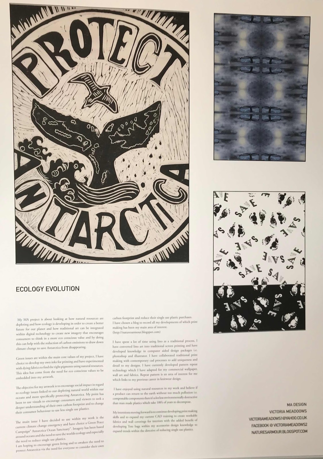
Interesting texture of Church showing layers of time with it's historical journey.
Design Philosophy


Evoking warmness, romanticism, a place for people to find a different feeling of longevity attaching people to historical values as a means to honour and respect previous times,landscapes and natural forms. To evoke and understanding of synogy harmony, balance and emblematic choices. To encourage peoples to reflect on valuing the environment.
The concepts that things do not have to be recycled, up-cycled or made out of used products.
Even if it isn't, the value is in the design concepts in terms of visual methodology, in order to incorporate knowledge  of eco-conscious values of longevity.
For example coll aging is an age old attempt of creating new from already printed paper or fabrics. So to be vintage inspired as a designer one can be pushing an awareness of cherishing what has already been and gone.

Saving the planet by valuing within printed concepts using juxtaposing style which suits present day fashion in order to sustain and create an atmosphere that encourages homely environments. A live at let live attitude without the necessity to re design constantly the environment that we live in, more of an adding process and a building of new within a system that allows new to sit with old in a way that harmonies effectively. Saving nature and paying homage through printed fabrics ,living a lifestyle which encourages an historical and contemporary fusion. "Embedding social history into contemporary design aspirations" as a way of telling a visual story.


Working Practice Processes

In order to evaluate processes one has to consider what processes are used in the first place. I have worked as a designer for many years and have processed many techniques, I know have a affinity and balance in regard to how to process new concepts ideas and process them. I do use many influences that I have created through my designing and their are many complex processes to consider through , however one can break down physical and cognitive values and direct processes.
I would like to quote a recent contemporary designer who said " Instead, I found the kind of wild imagination and attention to detail that can only be produced when a person carries out a vision that pertains to no one else but themselves."(Alexander McQueen)
 This reminds me of how vision and visual imagination can direct a persons direction when creating.
Firstly I usually create mood-boards, it could be an interesting page in my sketch book that utopias a emblematic affinity to an overall feeling mood and contextual concepts. A mood board visual notation that links to were I want my collection to go to. I also create mind maps to explain how each element should link and what philosophy is required.


A rounded feeling of aspiration and direction. I then create ideas in different size sketch books, I do this so I can read or visualize them out on a large cutting table or all around me were ever I might be designing. I then choose a drawing or re draw on paper usually A3 or sometimes smaller, if its colour I am looking for I will select colours these would already be added to storyboard. I then consider tactile responses mixing yarns , mixing similar colours, choices of fabrics and reasons for my choices. 
Once I formulate an idea, I then iron out anything that isn't designed yet and work from there to create a small prototype a rough design concept to see if the idea works from there I build up different ideas that link mix ideas together and create a fusion of samples to inform and direct towards a final collection of products, fabrics designed drawings with technical information attached to be able to recreate for production purposes.

Within my previous knitwear design practice I choose yarns to create fabric and detail, however within print textiles I have been choosing inks and different types of paper including Japanese printing paper and off white parchments. I have then decided on fabric directions which will be linen/cottons to evoke a feeling linking to the paper I have been using.
Once I have chosen a pattern that I have sketched first into a a sketch book I create it in the medium chosen as an end product. I am interested in an handcrafted finish to equate to arts and crafts, however it also needs to be professional within its finished process. I do this by looking at the finishing of the product and it's tactile value and also how it links in terms of contemporary direction. Splitting different elements of the design process is a professional approach which occurs during the processes, I do this cognitively as I am working through different processes.
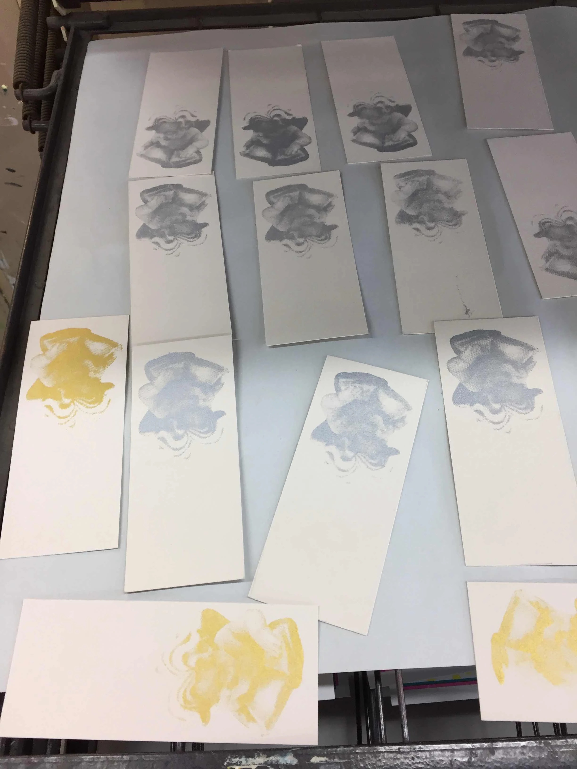
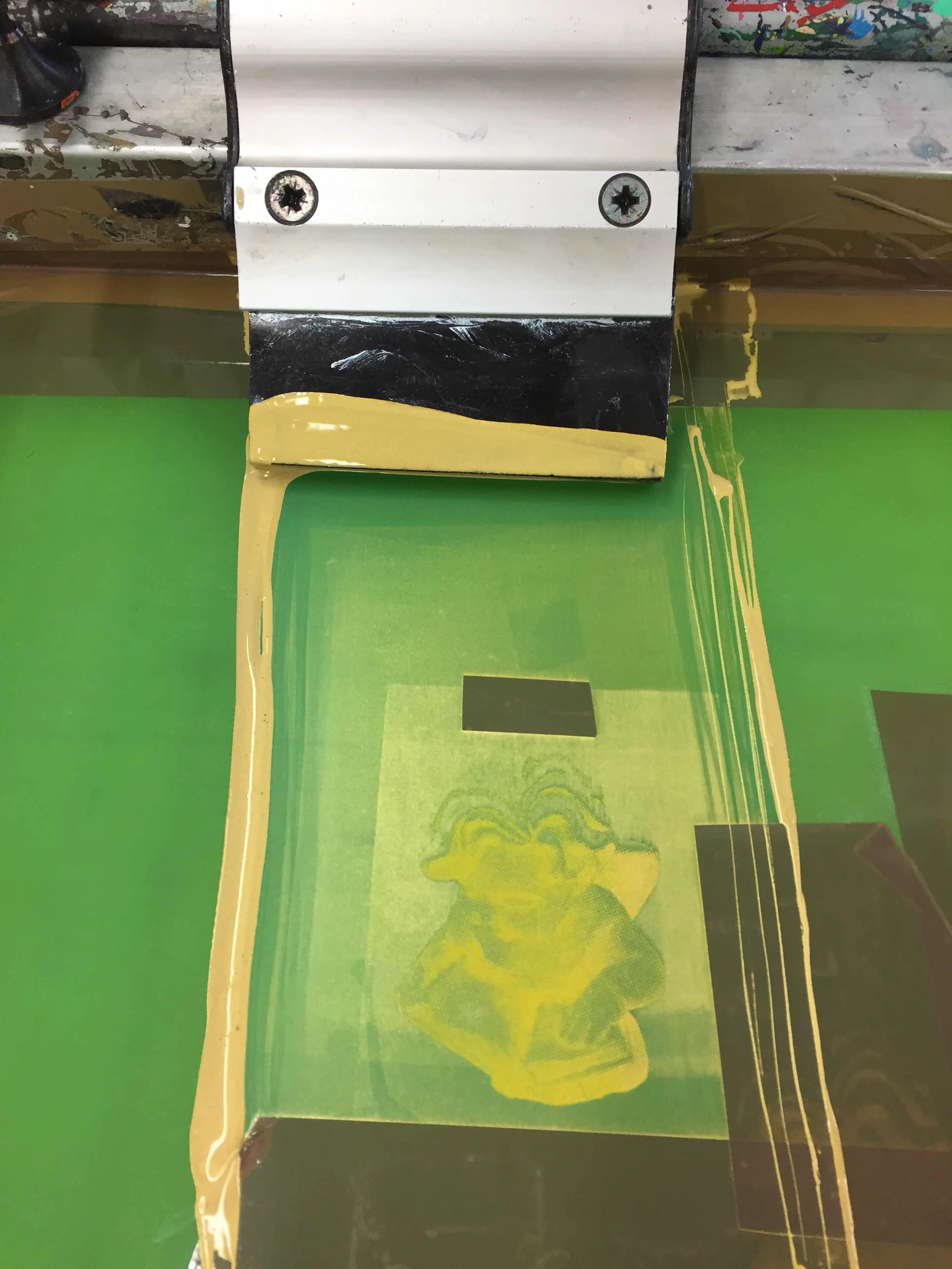
I have choice to look at lino printing due to it's limitations that links to my previous knitwear design having cut out using cutting shears creating a lot of ideas together and being limited inside of knitwear technologies.
Lino printing also has an nostalgic naive crafted link to folkloric aspirations which is a strong personal contextual direction inside my designing career. This is a type of art and craft I have aspired to through handmade fair-isle knits and accessories therefore practice has already been achieved inside this contextual theme.
The artists Pablo Picasso and Henri Matisse popularized lino printing in the early part of the 20th century.
My project brief is a celebration of textile and surface design technique looking at innovations of textile and surface design processes .Researching with a broad spectrum of techniques, including screen printing/wood cutting and casting metals and other processes. Collaborating detailing and embellishment using different printed textiles for fashion and interiors. Digital art,embroidery and block printing techniques whether actual or digitization through photographic replication.Adding uniqueness and charm using decoupage laying and mixing coll aging. Inspired through historical and contemporary arts and crafts through glob trotting tribal influences of lifestyle and traditional choices(anthropology) 
I will be references previous work into an unique archive and also creating inspirational secondary and primary research to link too my new hybrid mixed media approach to textile and hardware haberdashery collection.
I have been using Pinterest to collected research visuals , moodboards within contemporary commercial purposes. The design industry has forecast companies which build up information via fabric and yarn shows showing fabrics and yarns including hardware for fashion and textiles buttons , fastening, ribbons, braids etc. Forecast companies and designers create boards showing predicted themes and colours for forward seasons.Pinterest allows people to create research pages within different subjects. I am using this site to split my concepts and theme areas into groups and areas including historical and contemporary arts and crafts across the globe.


Design Processes in Context.

                      Natural Forms

Wood is interesting patterns and shadows


While photographing natures detail I find it evokes imagination and it is important for me to look at natures texture and pattern-ation in order to gain design inspirations.
It is also primary research which makes it clearly your own academic property in order to keep a strong working practice identity and maintaining your own academic property.

Through visual  research I have found similar patterns within natural structures which tends to follow suit within different forms. 

The agate stones I been researching recently has similar patterns to wood probably due to them being wood at one time and evolution has maintained certain pattern structures. The patterns and shadows that are created through light and shade,  using photographic equipment, capturing nature is a valued approach to designing, gaining textures and tactile effects for design developments through nature.

 I have become aware that my reasoning for choices is sometimes about warming and naturing connected to a response towards natures natural journeys.The wood photograph of a fallen tree tells a story of it's life span, its previous journey from seed to tree to it's present state. It's got an ancient value since its demise to fallen tree, however it still has many uses in the environment and is visually appealing close up and also when looking across the landscape.


The viewer ,consumer, responses to visual design work is a consideration when designing. The view point commercially is always considered in terms of how I wish my design work to evoke feelings and meaning.
  I consider that my work will encourage calm warming and relaxing environments for people to respond to. Wishing historical and contemporary journeys through history to be respected and valued as a response to the historical visual echoes in my work.

Historical and contemporary reasons within design is to evoke a response in order for people to value in more detail their own beliefs of eco-consciousness by reflecting the history of forna plant ecology and evolution inside of new hybrid, juxtaposing design style that links closely within contemporary design aspirations.

The idea and methodology behind  the keeping of historical design within design concepts and to push historical reasoning for fabric and home-ware into an new contemporary space is to challenge the understanding of how the world has been previously when nature was abundant and mankind had respect for for sustainability within the landscape before the industrial revolution. 

Re awaking knowledge of a previous lifestyle and a hope to a return to an idyllic   
warming and nurturing lifestyle which includes no pollution, no carbon omissions, no destruction of habitats, no extinction of important wildlife and forna  is part of the yearning of what modern society wishes for.
Consumers  holding in their lives an understanding that vintage warn out , patened printed and elaborated fabrics are akin to older fabrics and fashion that they might have already been produced and is still being used within a home space.

Allowing consumers the the choice of being contemporary by including a vintage heritage feel without the necessity to change to much and spend out to much. By designing fabrics that will morph into spaces already conceived and created in order to up beat them  including previous ownership philosophy. As a way in which to lower carbon omissions strategy could help towards reducing and drawing back global warming to a zero cap.

Evolution Natures Armour and Pattern-ation.

  While considering a new professional working practice within Art and Design parameters I have always considered print making an exciting and interesting skill to wish for moving forward. Within new technologies the arena of print making has increased considerably. New photographic industrial machines means that peoples choices can be fine tuned towards a more personal approach. Bespoke designs are becoming more and more accessible to the majority of people who are interested in gaining a more personal shopping experience.

 Since becoming a designer some 20 or so years ago I have noted an interest in printed fabrics, I however chose to study knitwear design as I was interested in textiles as well as fashion and knitwear bridged a cap for me. However since becoming a parent, I stopped running my fashion business to concentrate on my family and took up teaching originally Art and Design, however I now teach a number of subjects across a wide range of learners age group and skill sets. It is a very interesting and fulfilling job role.

 However I am still a keen designer and have set my mind at learning and creating printed textiles. While considering this new skill it has become apparent that it is important to dissect in detail all my different influences and processes. In a new and immensely structured way of following a pathway of designer directions for the viewer to consider.

 This helps to define and structure new design direction and acts like a diary of thoughts and feelings, in essence it should be an interesting look inside the mind of a creator. Therefore I will be discussing in a lot more detail the why's and reasons for my particular methodology this will include various links to previous work, life experiences and family history. I will start with a deeply paired down approach to my type of working practice skills set. In other wards bite size descriptions of what I have achieved and find away of designing using printing as a skill.

The main research within what I look for in order to create are Colour ,texture and Pattern. When designing I am always considering ranges of designs and in this case it is fabrics using tradition and modern technologies. Colour is a key aspect to my work, it doesn't have to have any colour, however precise colour and fabric use are exclusively selected for the best outcome. Secondly texture which is necessary for a tactile approach, it doesn't however have to be 3D it's purely its functionality and purpose that links to exacting directions of importance for the consumer, that is the viewer the appreciator that is important to consider in great detail in order to be current and directional.

My personal choices when Designing are?

Pattern can in fact be in detail, an embellishment, a finishing technique or a pattern. The pattern could be placed , all over or motif-ed. Pattern-ation can however be limited to another area of design i.e it could be separate from the design itself(however it would link). Within these three areas of choice, historical morphing into contemporary( is also a must do) within each creative element I choose to create. One main criteria is an absolute must and that is mood and affinity to embrace a feeling of romanticism linked to organic nature.

What has been interesting for me over the last couple of months is that I have changed my medium (material chooses and it has made it even more clearer why I design and the purpose of what I create no matter what the end product becomes. Creating has always included for me a lot of juxtaposing of detailing within complex modernity's, in order to create new evoking cutting edge directional designs, there is however a need to be simplistic at the same time.Which all by itself sounds lik a contraction. Thats what juxtaposing includes,it's also my believe thats it's extremely difficult to explain visuals without an image or practical work present so I think thats important to remember.
 I will be looking at all of my previous skill knowledge and adding them into a new why of creating fabrics for interiors and fashion. Mixing contemporary design concepts with historical reflections and the reasons why will be one of my key discussions and research while print making and hardware designing for interiors and fashion. The reasons for choices are much more detailed than one might of thought. I am currently thinking about the following theories for my assignment, analyzing key points in terms of Psychology, anthropology and ancient philosophy.

Texture and tactile importance of each design is key to my practical evaluations it has to be very comfort valued, it has to evoke an nostalgic premise of times gone by. Pattern-ated through time, weathered looking and warn to to create a ancient artifact,a "time and memorial"reflection. This sort of design handwriting evokes a country-side purpose that newness is better warn and weathered to become personalized and favored (like a favorite sweater or old pair of jeans).

Paint Palette : Concept idea.

Thursday 1 March 2018

Winter Photography

       The Angel in the Garden


Shadows on the brickwork and snow evoking reflections and tactile interests.

       Ideas for photographic printed textiles

                I have always had an interest in photography and over the Christmas period I had an opportunity to use some excellent Cannon photographic equipment while studying my Masters in Design. I am currently looking at different techniques to create and fine different images. I have used a micro lens fir the photo of the garden angel. I am looking at printed fabric design for interiors and fashion. This particular image I will be having as look at photo shopping using Adobe CC in order to create a fabric or a wall paper. I can see it developed into a wall paper using a gilt background. I have recently added silver and bronze leaf to a printed Lino design which I really enjoyed. Adding more detail to a one colour Lino print adding an extra dymention, opulence and uniqueness. 

Screen Printing

Research for Screen Print from sketch book


50’s style printed fabric ideas from sketch book

Sketch book Mood Board Influences.


Stencil Cutting for Screen Printing

These images shows the process of cutting patterns into paper which is then added to a 
screen and used instead of using photographic inks to create screens. This method is very throw a way as the paper can only be used for a short period of time and it can only be used once maybe a few times. However the use of a knife to cut into paper gives a type of linear effect that I was looking for as apposed to painterly.
I cut 3 different stencils with the same simplistic value of hearts and floral stencils to give a modern yet throw back to the 50's simplistic life styles. In order to utilize this technique I have saved the screen printed paper printed for each layer and I hope to scan and add to more imagery to give more depth through photo shop and illustrator techniques. Experimenting with different mediums to create a tactile feel to my printed textiles. For this style of print to work with my previous design practice of Knitwear more emphasis
Hand cut method of creating a repeat pattern.
 of historical craft is needed to add more history will add more longevity to my work.
Folk art has been and still is a influence on my work. Treasures of American Folk Art  is a really lovely book with some great images.
Understanding human social and cultural historical crafts created for home-ware gives an insight into what people like through main stream society.


Folk Art is were I think I need to push my illustrations to make them more commercial and a lot me valid as using grids and a campus to add a more commercial effect is also something I need to start doing. Finding ideas and interpretations is what I have been achieving so far.
To extend my work and achieve a good working practice I need to complete some finished illustrated wall papers and fabric designs .
Folk Sketch Book Developments


When I have created a finished design idea I need to then create a screen. If I am wanting to create wall paper it is a different screen due to it having to use slightly different mesh.
If it has more than one colour then it needs two screens and marking up lines or dots need to be added to this to make it line up effectively . The dots or tape put onto tables can give good guidance for accuracy.
For fabric panels for swatch format I am going to print flat square sample which are 24 inch by 22 inch.
For better effect I am hoping to use a large screen and print a double swatch and add to header board.(header board needs to be designed with Ecology Evolution. 
The treasures of Folk Art from Museum of Folk Art
by Gerald C Wertkin


 I am considering different background colours and textures. Sometimes if your not careful you can rip the paper and then it's ruined. The right way is to take your time and turn the paper around. I used a simple stanley knife to cut into cheap newspaper end of roll up-cycled paper. The colours I used were blues to fit into the scheme of other prints that I have been creating and also I added an orange to represent a colour that links to the colour of flowers and also I warn out rusted look which I will be using further on in the collection.

Evaluation: I have tried some screen printing using stencils, my feelings about this is that the stencils have a quality of their own and link to fabrics that are cut into to create detail using industrial stencil cutting or hand cutting. 
Materials that don't fray i.e leather or suede would work well for this technique.
Cut patterns into newspaper.

Creating a harmonious colour theory between all design concepts within the collection is what I strive to achieve when designing. Colour is an important factor to me and making choices is key. I usually create a separate palette for different themed collections.


These images shows the process of cutting patterns into paper which is then added to a screen and used instead of using photographic inks to create screens. This method is very throw a way as the paper can only be used for a short period of time and it can only be used once.
I am interested in creating some laser cut out fabric or mini artifacts to add to fabric or accessories. This will come later on in the project so watch this space for more updates and research.

The hand cutting does mean that the effect is very much a naive image. If I was to continue with this look I would need to add some historical traditional Scandinavian images.
I have been using Instagram and sketch books to advance this idea.   
I also would need to use some technical drawing skills, ruler compass to remove some of the quickness and hand drawn effect as presently its too much.

Brief over view of project

Poster for MA Show The Poster used for the end of project show at University Lincoln. MA studio in Design end of Degree Show June 20...