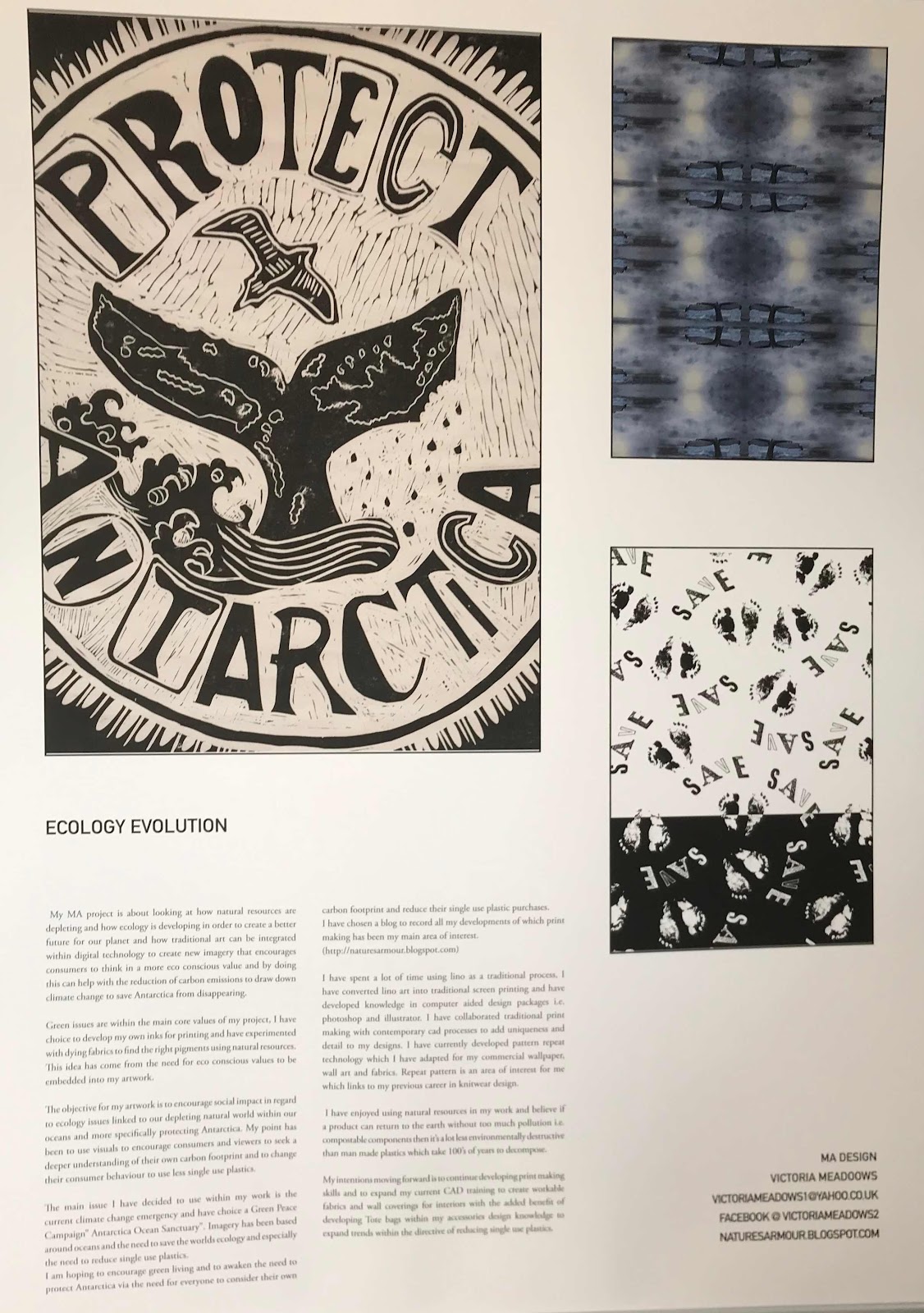
Pebble Project
 |
| Volcanic rock and Seascape:Mallorca Spain. |
Initial Lino printing technique I have chosen is a sketchy organic style of cutting. I have used an image initially created in pencil taken from an initial project brief created by the RCA in regard to improving sleep . I have designed a number of ideas within a sketch book and decided on looking at organic forms those forms sent me thinking about what I wished to create I therefore to initial images while walking in my local countryside, however what I found was mainly green or brown these colours and the natural items I was looking at wasn’t fitting for the project I was pursuing. I thought about harmony and tranquility and remembering were I always feel calm and relaxed I remembered days on the beach ambeling along the beach. I thought of lazy days, however I kept thinking about nature landscapes and seascape seemed fitting. Sand wasn’t tactile enough and the imagery wasn’t compelling , shells were too bathroom based for an image to calm within a sleepy lounge or bedroom. I used to collect shells and I love drawing them, however I needed something else as I was sat roaming the internet which isn’t necessarily the best choice as it’s too fast a space to contemplate , I looked past the computer and picked up something that was decorated in paint to mimic a lady bird. I shot out of my seat looking for more of these found objects from nature’s landscape. I had found my ureaka moment. The object with a calming tactile equality that inspires the minds of nations around the world. An item used for tranquility, contemplation, relaxation and harmony. The Pebble Collection had been formulated within concepts.
While researching I found a number of interesting points and within ancient sociology links to homage to live and death which I will link in to the blog moving forward. As I was researching and creating an idea for an object which could warm up a bed, warm hands, and warm feet . It’s purpose was to relax and help sleep, however it needed to be opened and in doing this I became reflective of what might be inside a pebble. This is when I reached another pathway of elaborated decoration created by nature’s adoration of the colours of the rainbow . Agate was know part of the pebble collection.I will add images moving forward. Fabrics and details of interest to create a collection of interlinking concepts and ideas.
Seas have been the holiday locations of the world, humans have been influenced by the shores of our seas for centuries. They are important parts of human society and also for nature and the habitats of many sea mammals and fish. The sea is being polluted by plastic pollution and it is destroying a lot of our natural world. We need to make fundamental changes within our own life style choices before we loose the beauty of our world. I have selected a clip from my families holidays from the 1960's just to evoke an understanding of what our shores used to be like in terms of nature and human developments within our shore line and were it is today.
Cornwall Saint Ives.
The Blue Effect: Theory of Colour
The blue effect of water,the psychology of blue. Humans are distinctively drawn towards blue water and not muddy water. We know this because scientists have worked on the theory many times. Blue is a cool colour and can relax the mind.
Within the principles of design, the blue effect via research by Jill Bulter a lagoon type of water hole in Derbyshire via industrial mining created a lagoon style lake in the hills. Unfortunately it was highly toxic, this was not stopping people trying to swim in it, calcite crystals from limestone rocks contaminated the water making it highly toxic. i have swam in a blue lagoon and it is an amazing feeling within its turquoise dynamics which are emotionally intoxicating. In general it is known that blue decreases anxiety.
Due to the number of people repeatedly trying to swim in the pool. The local authority changed the colour by adding dye which stopped peoples interest in swimming there.
The instinctive values of living creatures to find and be drawn to clear blue waters via ancestral links and natures evolution makes the colour blue more interesting than brown. Those selecting blue water processed through evolution and those that didn't choose effectively would eventually be selected out through survival of the fittest.
Considering using thought processes against instinct, instinct usually wins. The psychological effects of the colour blue and all the contextual meanings of the colur water and sky.
These are generally contextual, social context and productivity contexts.
One experiment that was carried out to prove this theory included a task in regard to creating as many different usages for a brick within a short period of time. These instructions came with different coloured backgrounds. The participants that choice a blue background more ideas and there work was more inspiring. Red background or red in general context is a hot colour and increases anxiety. Neutral colours generally have no effect.
Social context- perceptions of friendly feedback versus aggression.
In one study, 700 participants were asked to rate the officers on different attributes within a number of different attributes including honesty, approach-ability, friendliness.
The police officers in blue had the best feedback. It's not a co-incidence that the united nations has a blue logo.
In terms of productivity a number of experiments have been carried out one was the changing the colour of light in an office and test the productivity rate of individual people. Some floors had plain white and some had white light enriched with blue.
What happened was blue enriched white light and increased general alertness, concentration mood and performance.
"It's been repeatedly demonstrated that blue light blocks production of sleep hormone melatonin and activitates parts of the brain responsible for alertness. But what's good during the day is bad during the night. Blue enriched light experienced a night disrupts our circadian rhythms and has linked to serious health conditions like diabetes, cardiovascular problems and cancer" (Lyda.comBlueeffects from universal Principles of design 19.02.2018 12.21).
When considering designing for food in blue for example plates detour the desire to eat, however this could help people wanting to diet. People per sieved food on blue plates less interesting and not as appetizing as a white plate.
Inside of advertising blue aligns well with positive thinking and is used a lot in toothpaste and healthy products and also nurse and doctors uniforms. Blue can also signify peacefulness like a calm landscape within a blue sky.
Seas have been the holiday locations of the world, humans have been influenced by the shores of our seas for centuries. They are important parts of human society and also for nature and the habitats of many sea mammals and fish. The sea is being polluted by plastic pollution and it is destroying a lot of our natural world. We need to make fundamental changes within our own life style choices before we loose the beauty of our world. I have selected a clip from my families holidays from the 1960's just to evoke an understanding of what our shores used to be like in terms of nature and human developments within our shore line and were it is today.