Saturday 5 May 2018

Project Brief and Presentation

Project Brief Presentation


I am currently working on completing my own project brief for my Masters Degree in Design .I am specializing in Print including fabrics wallpapers, wall art and hardware for accessories fashion and home.
Initially I have had a number of different pathways and I have been looking at and amalgamating ideas into one project brief. Arts and crafts are of interest to me and I have choice the late 19th century/20th century and more specifically William Morris and his home and his love for Arthurian mythology.
I will be looking into IT and traditional techniques creating an integration of different techniques from contemporary to classic in order to inquire how to incorporate artisan heritage beliefs and values into a contemporary practice. Questions that I am looking at are how vintage , warn out historical weathered patented effects encourage mood and feeling within the viewer point of view. The main point of the brief is to experiment with different techniques and effects to create a tactile vintage artisan crafted art process. 
I am honing in on my creative practice and it is not the theme or subject that is important nor the product. It is the effects created by different processes and juxtaposing these together to create uniqueness and opulence in order to evoke harmony and beautiful indulgence for the viewer (customer)clientele.  
The inquiry for my project is to look at the methods of print inside of digital and traditional processes ,therefore it's the processes that evoke the questions for my design practice.
One of the questions is to evoke a response that creates a human handmade process to a modern contemporary process (machine made).
Looking into tactile ,vintage,warn away, heritage feel process to evoke nostalgic references of grand lifestyles and harmony of days gone by. 

I have also been researching converting my blog into a blog book and I have found a company in the U.S.A
called blog2print. They are printers to hardback or soft back. I have choice to create a number of volumes which I will number as part of my final Masters Degree presentation. I have noticed however that some of the headers on  my posts have become incripted in the print so  will need to edit these areas.
William Morris described himself as an Artist and a designer and this is an aspiration of mine. I have been a designer for many years and printing imagery for paper and fabric gives me a new direction into the field of print maker artist artisan which is of interest to me. I hope to create a series of wall Art and exhibit in the hope to gain feed back on one of my inquiring questions which is about how different techniques effect the viewers perceptions on how they value images. Specifically looking at historical heritage view points.


Blog2Book front cover.


Initial project brief
Photograph of William Morris.


Page from Blog to book . 


Tuesday 1 May 2018

Screen Printing Screens

Screen printing

 Screen printing the Cherub image in different ways and effects.
The first screen I made using traditional light effective paint using a digital image which I took using a canon SLR digital with a high pixel level. I was able to put a large image and smaller images of the same cherub in a repeat pattern . I have also used photoshop to create the same image with different background colours and grey scale effect adding colour in 18 different colourways printed using the Ma Maci suit fabric system.
                                                                       Header Card for fabric swatches 
Header card in two colours.
Header card printed to fold over fabric swatches.
Initial computer text and hand painted filagree.

Headers being used with Memaki cotton and cotton/linen fabric prints 
Meemaki photographic cotton fabric prints

Warn out faded vintage background test

Sketch book image

Sketch book work showing hand drawn cherubs.

Mixing scale and colour of cherubs onto paper.

Sketch book showing swing ticket developments

Example of sketch book research and journal reflective notes and development.
I have chosen Evolution as a name for the fabric collection as the previous title was too long. Evolution represents the journey of my  ideas and also the development of the natural earth which also links into theory and context of my working practice previously discussed within the title Natures Armour.
The Evolution text is Georgian text , however I think the letters could be improved by squashing the letters together and trying bold text. I looks fine for my presentation brief review in a couple of weeks. 

Hand drawn Cherub screen print

I am currently developing a new repeat pattern taken from the photograph of the cherub reading that resides in my garden. I am wanting a small repeat pattern to add to a scarf design/dress fabric.
I think the drawing needs more developing possibly try painting it to make it more fluid and simplified.

The cherub on the left has been created into a screen for printing.
Rough sketch of stars,need to develop more detail/precision. 

Hand drawn star, a rough sketch idea for a second colour and detail on a matching fabric to co ordinate a range of fabric within a similar motif design. Choosing the same image helps to reflect on the characteristics of all the different printing techniques available and which applies for the best design choices.

Honing in on Project brief

Lino Print
I have been experimenting with lino printing since November last year. I have cut my hands once or twice doing it, it takes a certain type of skill which is interesting and rewarding and I think this lino is one of my best so far. It has been taken from the photograph I took over Christmas using a good quality SLR with a micro lens. This image which has a lot of historical references I have chosen as it gives a spiritual blessing to those who visualize it,similar to the cherubs have been painted over the centuries and angels have a lot of symbolic meaning. This sort of imagine has a lot of longevity and meaning. 


I would like to print this in the negative of what I have printed it and compare the two together.Also changing the scale would also be interesting, I have only been working on A5. Another idea would be to reflect image so they looked in different directions. Creating a mirror image and playing with some sort of repeat maybe adding another motif. This image was picked out as an endearing, however it doesn't link to Evolution: patternation, armour and embellishment.


Drawing used to mark image onto lino using pencil on the back, traditional tracing technique.

Lino print using an interesting duck egg colour with more green than previously mixed to add a more vintage feel. Paper is just old news print.
This is the drawing I used to create my Lino cut.I put a lot of pencil on the back   lined it up on the Lino and pressed down on the the paper with a pencil to trace on to Lino. I then cut Lino background away so what is left is printed. I choice to cut a halo effect which is similar to some day of the dead crosses I have previously seen within altars.

Wednesday 25 April 2018

Old Printing techniques


This machine is showing the old analogue way of creating print the same as it would have been created before computer aided printing techniques. The effects are slightly different to the effects created via a computer, it is only slight, however still different. It is these different qualities depending on  whether it is a digital process or more traditional that evokes interest in my way of thinking and how one can create interest in this way by using 


Printing Techniques


Old Fashioned Traditional Printing Technique.


Vintage printer using metal text lettering .I have spent an afternoon in the print room after chasing a lot of other needs with various academic tutors in order to start collecting and collating visual information past and present.


I have booked a super intense scanner which can scan A2 and also scan transparencies which are old format colour negatives, these were used when I was running a fashion company selling soft accessories to small independents stores and large department stores and chains across the globe.

I need to show some previous work when I show my work so far at a presentation.This is were I will explain my interest in digital and traditional practices and how I wish to inquire how they can be integrated together to inform my new print practice techniques and art developments.
This image shows the vintage lettering set using blank metal pieces to line up words. The ink
can naturally fade out depending on how much ink is left on the metal letters also inks can be mixed to a more natural human eye to print concept.
The result of the printing technique: Traditional phrase, shows the traditional process of lettering used.


I have printed this traditional English phrase in a old sepia colour to reflect the colour of old photographs and print. This colour and chalky paper colours that I have  chosen link to a process I am developing in regard to the effects that traditional vintage ancient artifacts have on the viewer consumer. 

Sunday 15 April 2018

Research and Illustration

Research Resources

Book wise-A great secondhand book shop clearly sectioned just like a library.


I have spent many years collecting resource books for my designing and have spent my time browsing local markets and second hand charity book stores. Luckily for me I have a little town near me called Southwell it has a little market which has a book stall and a book shop which has a lot of donations of second hand books arriving daily. I have taken to buying little
vintage books on nature and foliage which I find really inspiring. The nature of holding an old vintage book gives me a sense of nostalgic references that I am wishing to embellish onto my design work


Books purchased for illustration and theory.
The large Zinc white gouche I have been adding to my Windsor and Newton paint palate to get the chalky dusty rustic vintage colour ways within my work. While I have been printing, whether it is lino print or a screen print I have been creating my own palate and keeping my inks labelled and kept save in the print room. Cohesion with my colour palette across my design developments is important. I have designed a header card for my fabrics for display purposes as I like to see  developments during my design processes. I am also using different size sketch books as I like to work on different areas of my project at the same time.Also when designing I can look at one or more ideas at a time in order to gain more inspiration and direction.
I will be creating a multi colour screen print for wall paper and also for fabric this will mean I will need to create different screens as fabric screen printing requires a different screen type. I will also be creating different colourways for this design.The image will be patterned across on a diagonal repeat. The background will also vary in colour. 
House Martins that fly around Sycamore Cottage.
         I have lined drawn images of British birds that link to my surroundings as part of my project brief. I have photocopied a number of copies and have painted the original drawing ready to create a screen print using traditional methods.
Blue tits and Finches Sycamore Cottage.
The birds I have drawn have been 
using the vintage reference books created for wildlife enthusiasts and bird watchers and therefore give precise information of what they look like and what sort of nests and eggs they have. I am interested in adding more imagery to my fabric and wall paper ideas to explain visually were the birds live and what the environment its like in order to create a country feel and understanding of the wealth of natural beauty available in England.  
Windsor and Newton Paint Palette Water colour. I am loving the painted effect of my This old paint  pallette and would love it as an all over wall paper abstract with lots of tactile influence similar to marble and Agate stone.
I love these birds that I have drawn and wish to also create leafs, butterfly's and insects ,a trellis type of fabric repeat would also suite these images.
The Little Vintage book I have used for reference purposes is called "Intersting British Birds "by Kathleen N.Daly and is illustrated by Eric Tansley and Robert Aitchen. and is published by Blackie & Son ltd.
I must look on line via Ebay or Gumtree for similar books.
Water Colour using 4 colours 5 if I include white

Blue Tits and Finches 

Thursday 12 April 2018

Storyboard Concepts

Storyboards
The following images are storyboard development ideas to create a number of storyboards to link to specific design developments. While creating designs and also considering which direction to go with in regard to my project brief I have been sources and references images 

William Morris Illustration.
William Morris
Wall paper and fabric by William Morris
William Morris Tile
                     
William Morris was born in the 19th century(24 March 1834-3 October 1896) and was the founder of the Arts and Crafts movement and was deemed an aesthete by many. He was also linked to the pre-Raphaelite painters including William Holman-Hunt, Ford Maddox Brown and many more.He was friends with Edward Burn Jones Dante Gabriel Rossetti and while he was working as an architect, after graduating from Exeter College he gave up to paint and design. He was an English designer, craft person,textile designer,poet and socialist. He designed furniture,fabrics, wallpaper, book covers and even stain glass. 
 He married in 1859 Jane Burden and they had a house built by Philip Webb.They spent two years decorating their new home after which they decided to start their own interiors business. They initially
made furniture, tableware , soft furnishings and wall paper. He also designed book covers. He loved houses and loved decorating them. He once said and which has since become a famous quote"Have nothing in your home that you do not know to be useful, or believe to be beautiful".
I love this quote so much I am adding it into my collection within a print development using old text which have to be place together intricately. It might look nice with an illustration.


Book cover design by William Morris
He started a printing business called
Kelmscott Press were he published and
illustrated.
William Morris


Natures :Evolution, Natures Armor and Pattern-ation.


Natures Armor is a blog showing the work and philosophy. Showing a history of design work over my career and including a new body of work for my MA Degree. I am currently researching ways in which to add Natures evolution and patter- nation into a print project I am currently perusing at Lincoln University, Lincoln England. It's an interesting subject especially since the series Blue Planet has been running and my special friend David Attenbourgh who has been a great influence on my life from my early years. I have decided to pay homage to him and also to the world at large and even the Universe. Eco conscious values are key to the future of Fashion and textiles we all want to save our planet from unnecessary wanton destruction. I will be sharing my thoughts with you on this subject.

 Natures: Evolution Armor and Patter-nation 

While considering a new professional working practice within Art and Design parameters I have always considered print making an exciting and interesting skill to wish for moving forward. Within new technologies the arena of print making has increased considerably. New photographic industrial machines mean that peoples choices can be fine-tuned towards a more personal approach. Bespoke designs are becoming more and more accessible to the majority of people who are interested in gaining a more personal shopping experience.

 Since becoming a designer some 20 or so years ago. I have noted an interest in printed fabrics, I however choose to study knitwear design as I was interested in textiles as well as fashion and knitwear bridged a cap for me. However, I believe since becoming a parent, I stopped running my fashion business to concentrate on my family and took to teaching originally Art and Design however I now teach a number of subjects across a wide range of learners age group and skill sets. It is a very interesting and fulfilling job role.

  I am still a keen designer and have set my mind at learning and creating printed textiles with new ideas within hardware(haberdashery) for interiors and fashion. While considering this new skill it has become apparent that dissecting in detail all my different influences and processes is quite complex.
Finding  new and immensely structured ways of following a pathway for my creative work will allow my design directions to become more cohesive.
For the viewer to understand and consider as an interesting look inside the mind of a creator giving a more personal incite to my work.
 Therefore, I will be discussing in a lot more detail the whys and reasons for my methodology this will include various links to previous work, life experiences and family history, which links to identity themes and eras. I will start with a deeply paired down approach to my type of working practice skills set. The main research within what I look for in order to create are : Colour , texture and Pattern-ation.

When designing I am always considering large ranges of designs concepts and in this case, it is fabrics using tradition and modern technologies. Colour is a key aspect to my work, it doesn't have to have lots of colour, however precise colour and fabric use are exclusively selected for the best outcome. Secondly texture which is necessary for a tactile approach, however it doesn’t have to be 3d.

It is not just its pure functionality and purpose that links to exacting directions of importance, it’s the desire to create surface design that is the true nature of my ideas the product is secondary however still important but does not link as i am only interested in surface design(fabrics, wallpapers)
The Consumer: The reason for the design is its function and for what purpose?
 For the consumer, that is the viewer the appreciator that is important to consider in great detail when creating. Pattern-ation follows which can in fact be an detail an embellishment a finishing technique or a pattern. The pattern could be placed , all over or motif-ed.

Patternation can however be limited to another area of design i.e it could be separate from the product design itself i.e surface design concepts. Within these three areas of choice one main criteria is an absolute must and that is mood and affinity to embrace a feeling of romanticism, organic, historical morphing into contemporary, this is also I must do within each creative element I choose to create.
 What has been interesting for me over the last couple of months is that I have changed my medium (material chooses, and it has made it even more clearer why I design and the purpose of what I create no matter what the end product becomes. Creating has always included for me a lot of juxtaposing of detailing within complex modernity's, in order to create new evoking cutting edge directional designs, there is however a need to be simplistic at the same time.

I will be looking at all of my previous skill knowledge and adding them into a new why of creating fabrics for interiors and fashion. Mixing contemporary design concepts with historical reflections and the reasons why will be one of my key discussions and research. Including print making and hardware designing for home interiors fabrics and wall papers,Wall Art.
The reasons for choices are much more detailed than one might of thought. I will be analyzing key points in terms of psychology, anthropology and ancient philosophy. All these under pinning concepts link to historical civilizations, human nature and the link between sociology and religion.


Peacock Warwick Castle Walls. I have previously visited Warwick castle in order to build up an archive of imagery useful for creating personal creative images for different uses and reasons.

Inquiring Questions linking to designing within lifestyle choices ?
Connected to contemporary and historical arts and crafts circa 19th century and their ancient links?


What links are their between paying homage to nature our surroundings and the links to historical civilizations and their  view points?

How we as humans link to the cosmos, universe and nature?

Can we be deemed civilized without the need to replicate, embellish our own amour against natures elements and how we reflect nature while doing this?

How has evolution accredited our needs for luxury and harmony within our own surroundings and life styles?

Why we question and inquire more meaning and understanding of evolution and spiritualism as creatures of the world?

How certain artifacts and patterns are replicated across time and memorial across cultures and civilizations and how there are links?

            Contemporary Research

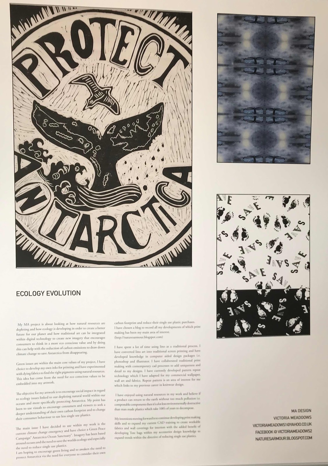
Timorous Beasties are a fabric and wall paper company that create interesting contemporary takes on traditional furnishings they also create one of up cycled furniture pieces that are aimed at a Boutique lead market.Our influences come from small independent designers who are using a eco conscious choice of printing creating their own inks and printing onto natural fibres.Below are pages from some of my sketch books.


Brief over view of project

Poster for MA Show The Poster used for the end of project show at University Lincoln. MA studio in Design end of Degree Show June 20...